
I recently had the pleasure of taking a new client out to look at homes for his first home purchase. Bright eyed and full of excitement, we embarked on an exciting quest for the perfect home. Although all of the homes that we viewed had exceptional qualities, some stood out more than others. In particular, one home's impression lingers in both of our minds not for its unmistakable charm, but rather for the overpowering color palette used within the home. Purple polka dot wallpaper, blue zebra print patterns and a yellow ceiling smacked us both square in the face when we opened the door to (what seemed like) a charming, historic bungalow. Understanding that homeowners should be able to express their unique styles within their homes, I do believe that when placing a home on the market, less is always more.
With rainbows of colored walls still dancing through my mind, I did a little research on the hidden psychology of colors within a home. Did you know that greens and blues are most suited for bedrooms and home offices? Perhaps you were not aware that shades of orange encourage social interaction within dining spaces? Here is a visual outline of some common areas of the home and the colors that are best suited for each:
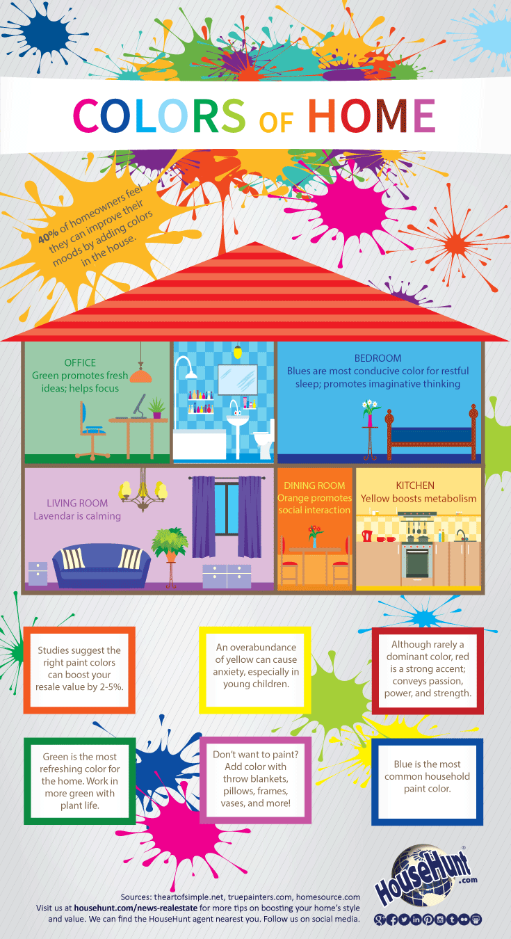
I believe that personal style is a crucial element in everyone's home. It creates a space that is perfect for whoever may be living there. However, it is important to remember that certain colors carry with them hidden, subconscious messages. When listing your home, assess how your audience may view your home. If you like to express yourself through color, make sure that those colors leave your buyers with positivie feelings....not hopes of finding a pot of gold at the end of a mentally lingeringrainbow.
Ryan Belinak
ryan@liveurbandenver.com
www.ryanbelinak.com
Cell: (303) 807-6495


Socials